The Most Successful Rebrandings of 2024: How to Transform Your Brand and Connect with New Markets
Explore the most successful rebrandings of 2024 and learn how brands transformed their identities to stand out and connect with new audiences.

By Rodrigo García
27 January, 2025
Rebranding is a process that allows brands to remain relevant and competitive, especially in a constantly changing market. Refreshing a brand identity is not only about updating a logo or colors; it can also mean redefining the message, values, and purpose of a company so it can connect more effectively with its audience. Below, we explore five of the most impactful rebrandings of 2024 and what they demonstrate about the importance of adapting to change.
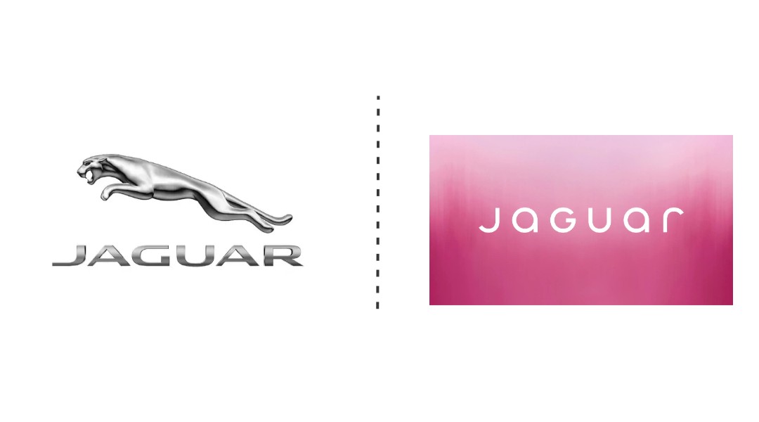
1. Jaguar: Evolution toward an electric future
In 2024, Jaguar moved away from its traditional dark-toned logo and introduced a completely new and bold visual identity. Vibrant colors such as electric pink, red, and yellow dominate the new identity, representing its transition toward a fully electric vehicle lineup. The change symbolizes a modern and sustainable future while appealing to a younger audience connected to technological trends.
Key lesson: Adapting to new technologies can require a radical change in visual identity, but it can also open doors to new markets.
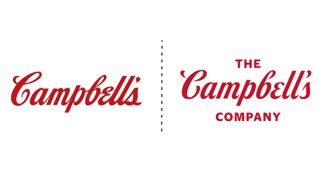
2. Campbell''s: Diversification with purpose
After more than a century of history, Campbell Soup Company changed its name to “The Campbell''s Company.” This move reflects its evolution from a brand focused primarily on soup into a broader food and snacks company, including successful brands such as Goldfish and Pepperidge Farm.
Key lesson: A name can be a powerful tool for communicating the scope and diversity of a brand.
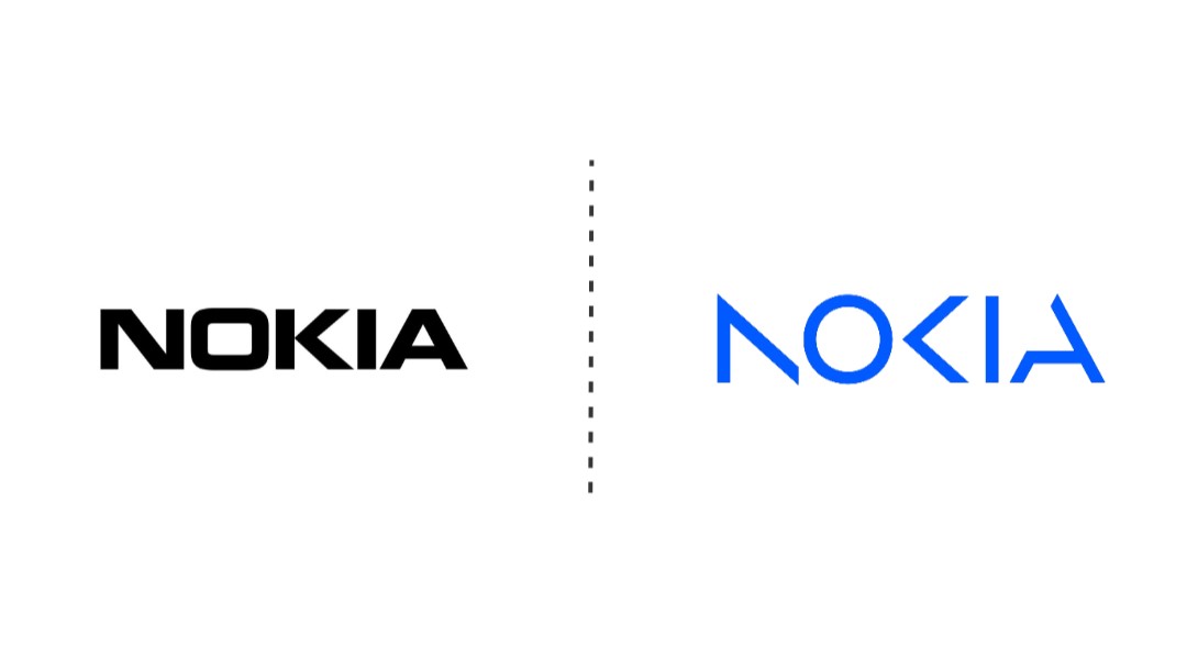
3. Nokia: A new technological focus
For the first time in 45 years, Nokia updated its logo. The new design, more angular and minimalist, reflects its evolution from manufacturing mobile phones to providing enterprise technology solutions. Nokia is now positioned as a reference in industrial connectivity and innovation.
Key lesson: Rebranding becomes essential when a brand redefines its purpose or changes its target market.
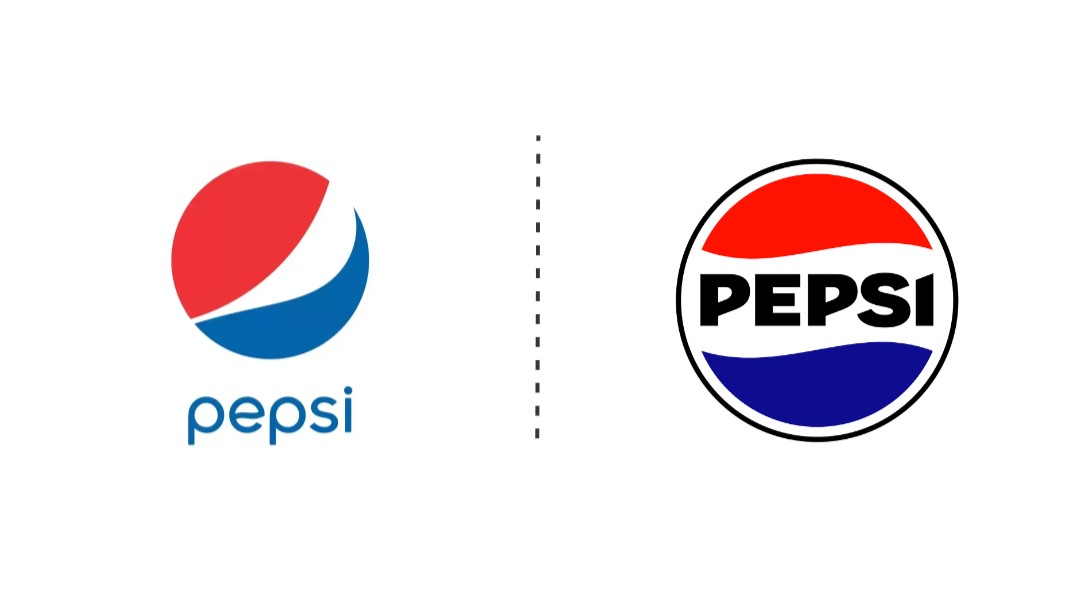
4. Pepsi: Modernity with nostalgia
Pepsi celebrated its 125th anniversary with a rebranding inspired by its historical legacy. It brought back elements from previous logos while incorporating vibrant colors and modern uppercase typography. This change connects with a broad audience, from nostalgic consumers to younger generations.
Key lesson: Honoring a brand''s history can be just as effective as looking toward the future.
5. Eurostar: Connecting Europe
Following its merger with Thalys, Eurostar renewed its identity in 2024. Its new logo emphasizes the union of the two companies, while its communication focuses on sustainability and connectivity, key objectives in its plan to double passenger numbers by 2030.
Key lesson: A rebranding can also be a long-term statement of intent.

Why should you consider a rebranding?
These examples show that rebranding is not simply a superficial change, but a strategic tool to:
Attract new audiences: A modern design can capture the attention of new markets.
Reflect internal changes: Evolving companies need an identity that supports their new direction.
Differentiate from competitors: A refreshed image can help a brand stand out in a saturated market.
Sometimes we are afraid to change, but planning and executing a rebranding strategically can be the key to revitalizing your brand and ensuring its long-term relevance.
Are you ready to work with aliens?